Ibiza Airport
Project: 2007-2008
Work: 2008-2009
[ibiza culture]
As agreed in the AENA public offer, various passenger route schemes were proposed, from classic gallery-type typologies, to working and including urban elements such as the square or the active façade. The main idea has been always to focus the reorganization of all of the commercial footprints within the journey, taking into account the seasonal nature of this airport, specially, what we have called Ibiza's "cultural filter".
The contact with the island, its people, visitors, the airport staff... have led us to a plural image of the island. We haven't considered Ibiza as the traditonal Ibiza for clubbing, for families, low-cost or environmental, but as an encounter between cultures, tradition and modernity, mixing typologies, architectures and materials.
We can confirm that Ibiza is a different space and its airport has to be a small part of the island, an initial, a first step or continuity, the last memory of a different trip.
Architectural Decision
The action is divided into three main areas:
- The ground floor : access and check-in area
- The upper floor: ground side area before filter
- The upper floor: air side area after filter
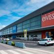
The change of image starts in the Acess Patio with an important job of visual merchandising on the Airport stores and the placement of its logo in 3 dimensions
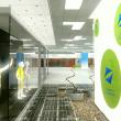
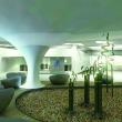
As a macro-scale sculpture. While going up to the access floor to the boarding gates, the passenger is directly in visual contact with the salt mine, working like a painting in this fluid space.The landscape of the salt mine works as a common thread, a background fabric that appears occasionally between the commercial kiosks, in the rest areas designed as small patios around an olive tree. The architecture of the kiosks uses the vocabulary of the ibizencan houses, their curves, whiteness, but updated, both in terms of design and material. The central rest island of the Earth Zone is also a reference to the Island.Thought as a "lounge" or "chillout" according to the vocabulary of the island, it allows passengers a last stop around a music kiosk before passing the filter.
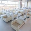
The Air zone, after the filter, is organized between a large commercial façade and the operational walkway.It is designed as an active square where kiosks and spaces for operational stays alternate.This interpenetration allows a feeling of proximity, of permeability that gives the passenger great freedom in the last moments before travelling.


