PORTO PI Shopping Center
07015 Palma, Balearic Islands
Extension: Sacyr – Testa Vallehermoso
SBA: 35 000m2
Completed architectural and engineering work.
Work monitoring
Expansion: February 2005
Porto Pi is a non-standard building, located on a rock at the end of the port of Mallorca, facing the sea, between the marina and the residence of the King of Spain. This 1980s building needed an internal rather than an external makeover, indeed the image of this bleached ship is still acceptable and communicative, but the industrial tone of the three floors of the building had to be changed. To this important work is added the treatment of the exterior commercial streets and the expansion with two two-storey buildings on the building’s terrace.
The request of reforming a shopping center is always a challenge for an architect. Achieving the essence of the commercial vocabulary, recreating perspectives, simplifying the journey of a visitor who is not very open to new customs, generating a new environment, according to traders is definitely an act of balance. When visiting the center MAAC’s first reaction is to generate a global project, developed not on architectural details, but on volumes and light. Make of a center a unique store with its own ergonomics and aesthetics, mark in an interactive and dynamic way, the flows and connections at the center.
The first action consisted in modifying the industrial and metallic aspect of the false ceiling. The existing installations and the low height of the floors preventing the installation of a new false ceiling, MAAC chose not to return to this constructive
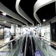
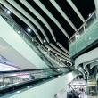
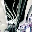
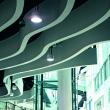
solution: «we wanted to make the ceiling disappear, darken it, recreate a lower white plan, and more dynamic, emphasizing the virtual visit of visitors».These suspended ribs follow the geometry of the Mall and accentuate the commercial perspective with a succession of random curves between which the suspended luminaire is inserted, a few white cylinders of light.
The fluency required for this project is also found in the work carried out with the glass railings, using a laminated glass that incorporates an ornamentation in a gradient of points, from white to transparent. This railing is scored with a wide, light wood handrail for better support. The floor reflects with simplicity this desire to travel, a white stripe, accented with black edges, draws a taut curve from each corner of the mall. The walkways on the first floor almost disappear with the use of the glass pavement.
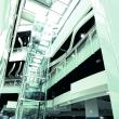
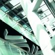
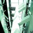
In the area of the large skylight, the vertical elements mark the volume. The pillars clad in a slightly sloping white sheet metal lining give a feeling of imbalance and the elevator's glass drawer with its exposed structure, placed like a totem pole in the courtyard, completes the commercial perspective. In the mall, the Inox store dividers recover a human rhythm and scale. Specifically, these vertical elements are supports for information and signalization defined by Luna with a desire for elegance, clarity and minimalism.
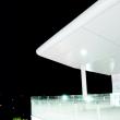
The same will that this reform generates can be read in the exterior areas of the center where the curved white structures and the stretched canvases complete a very transformed image, a metamorphosis.


